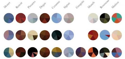
I have always thought it would be great to have a site that shows the color palettes used by some of the great artists. Now there is an infographic that provides just that. It shows 10 great artists and one color palette they used each year. You can view the full infographic at visual.ly.
Visualizing the world in a new light by highlighting creative ways to make data accessible.
Sunday, May 5, 2013
Who Faces Mental Illness?
This infographic shares interesting details about who in our society faces mental illness. It is more prevalent than you may have thought, but as a stigmatized disease it is not discussed much. You likely know people with mental illness, but may not know it afflicts those people. You can see the full infographic at Good.Is.
Tuesday, February 12, 2013
How British Colonialism Impacts Africa Today
I've been looking at maps that show a strong correlation between former British colonies in Africa and some other indicators. Let's start with the map showing where the British colonies were. You can see the bright pink stripe down the right indicates former British colonies. This map is thanks to the New World Encyclopedia.
Next we see a similar stripe on this map of the best and worst places to do business in Africa. As you can see, there is a strong correlation between the former British colonies and being a good place to do business. I don't know if the Humanosphere group that created this counted "English Speaking" as a key indicator, but interesting nonetheless.
Lastly, the Chinese seem to agree that these are the best places to do business in Africa, as they have been extremely busy investing their funds into the former British colonies as well. Again, the stripe down the right is strongly correlated to former British colonies. This map is thanks to the Foreign Policy Association blog.
Subscribe to:
Comments (Atom)


