
Wednesday, December 18, 2019
How Long Will It Last?
Is it recyclable? That doesn't mean that it will disintegrate this decade or century. See how long it will last, and how we recycle.

Sunday, May 5, 2013
The Palettes of Great Artists
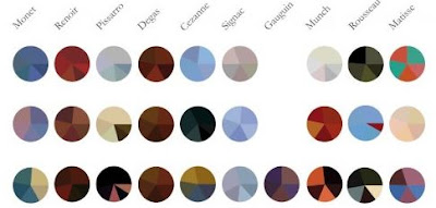
I have always thought it would be great to have a site that shows the color palettes used by some of the great artists. Now there is an infographic that provides just that. It shows 10 great artists and one color palette they used each year. You can view the full infographic at visual.ly.
Who Faces Mental Illness?
This infographic shares interesting details about who in our society faces mental illness. It is more prevalent than you may have thought, but as a stigmatized disease it is not discussed much. You likely know people with mental illness, but may not know it afflicts those people. You can see the full infographic at Good.Is.

Tuesday, February 12, 2013
How British Colonialism Impacts Africa Today
I've been looking at maps that show a strong correlation between former British colonies in Africa and some other indicators. Let's start with the map showing where the British colonies were. You can see the bright pink stripe down the right indicates former British colonies. This map is thanks to the New World Encyclopedia.

Next we see a similar stripe on this map of the best and worst places to do business in Africa. As you can see, there is a strong correlation between the former British colonies and being a good place to do business. I don't know if the Humanosphere group that created this counted "English Speaking" as a key indicator, but interesting nonetheless.

Lastly, the Chinese seem to agree that these are the best places to do business in Africa, as they have been extremely busy investing their funds into the former British colonies as well. Again, the stripe down the right is strongly correlated to former British colonies. This map is thanks to the Foreign Policy Association blog.

Tuesday, February 7, 2012
When Do You Tweet? Visualize It!
fd

You can dynamically generate a chart like the one above to show the density of tweets for any twitter account by time of day and day of week. The different circle shadings also show the number of tweets, replies and retweets. Create your own charts at xefer.com.
I like how this simple shart show so many dimmensions simultaneously. The bar chart on the left shows number of tweets, replies and retweets for each day of the week. The bar chart on the bottom shows the same by Day of Week, and the circles in the middle represent each hour of the week. Through this we can see that the FEMA director (@craigatfema) tweeks almost exclusively on weekdays between 7 AM and 6 PM.
Job Growth In the US

Though entirely political in message. This animated ad is one of the better uses of data that I've seen that is targetted to the mainstream US public. I saw this ad as a side-bar on cnn.com and wish I could embed the full flash version which shows the lines for the unemployment rate going down in red, and then changing to white when Obama enters office and climbing steadily over time.
Statistics can be dangerous in elections (because they are so often wrong, or make the politician seem wooden like Al Gore), but in this case I think it may resonate. What do you think? The ad links to a page showing a more detailed chart / ad for Obama.
Tuesday, January 31, 2012
The Steady March Toward An Integrated Society

The article "Segregation Hits Historic Low"is based on a report by the Manhattan Institute. The report claims "All-white neighborhoods in U.S. cities are effectively extinct."
Although this chart is simple, I like the way the lines of desegregation seem to march from the left side of the page toward the right. It conveys a feeling of movement and progress.
It is interesting that the most segregated city now (Detroit), is more integrated than even the most integrated city of 1970 shown in the chart (or close to it).
Subscribe to:
Posts (Atom)